by - Bryonny |dreamers|
1)
Brush size: Btween 19-24
Brush Type: Hard Edge (100%)
Brush Opacity: between 14 and 45
Smudge tool: between 2 and 19
Smudge Opacity: 54

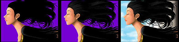
2) These pictures aren't numbered, so I'll refer to them according to the set of three
above the tips I give.
I personally always start off with a sketch. Helps you to put all your ideas down, and get a better idea of what you want to end up with at the end of the picture. It can be as simple as you like, or as complex. I tend to do things on the simpler side as I tend to get lazy when looking at super detail and difficult pieces and end unever finished them. (I'm what some may call an impulse artist)
The second thing I ALWAYS do, is fill in the background with a color I'll never use, but will contrast the picture. That way, I can always see where my coloring isnt't solid, has smeared, or whatnot. Its a ver usefull thing to do. It also helps you to look at the colors better.
Then, as you can see in the second picture, I fill in the part I want to work on first with a solid main color. This is the mid-color between the contrast of shadow and light you'll be applying. Start with a tone slightly darker than the solid color. Use the smudge tool to smooth out the inconsistancies. I made it a point to not use the "multiply" function in the brushes. It never creates a realistic skin tone. Though it may for other colors. Worl gradually down the shades to the final shade you want.

3) Here I take a look at what I've done without the line art I did in the first picture of the first set. I fix up the smudges and smeers untill its smooth and resembles what I want her face to look like. Then, so that I can get a better idea of where everything is on the face, I add in the eyes and the eyebrow. In this case, the eyes are closed , so there's not much to draw for them.
After that, I color in the places where light would hit. Using the smudge tool again, smooth out untill you can't tell where the mid tone begins and where the brightness ends. However, make sure that you don't smudge all of it. There are bright sheens to skin tones, especially when it comes to light-touched places (I'm horrible with terminology,,,forgive me u_U ;) )

The lips should not be bright red, it should be a shade between red and the skin tone, with the tiniest amount of purple tinting as possible. There's no purple in the lips I painted here, and it looks a little off because of it. Notice the shape and form of your own lips when you color. Where there are bumps and where there are smooth spots.
I decided that I didn't want white cloths on her, so I changed it to black. I also got a little lazy with the cloths lol. One thing about black is there's very little you can do with shading depending on the effect and the texture of the cloth you're using. I'm horrible with textures lol, so don't refer to my drawings for that lol. You can see the beginnings of the detailing in the last pictures of the above set.

Where light touches cloth, it is highlighted. And so her shoulder is highlighted, giving sense of depth. Though too much will make it seem unproportional to the other tones in the pictures so becareful of that. It should be brightest where the light touches most...then fading.
.
6) The shirt being done...as much as I'm willing to work on it so far, I moved on to the hair. I began with hughe block of black. Choose whichever color you'd like to use, and refer to real examples for the areas where you should brighten or darken. Note, choose only those places with the extremes. Sometimes too much detail kills the picture. Choose with care.
In the last picture of the set you can see that I made a background. Sky clouds are best made with a brush with a soft edge, usually with hardness at 0%. Dab it, don't draw lines. If you have a tablet, this part is easiest with one, I've never tired without one...so it may be harder with a mouse.
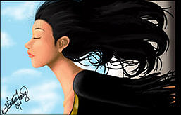
And this si the finished product. I hopt that this tutorial helped. These are literally the steps I use to draw. I may find another way in the future that is best for me, and I encourage everyone to explore on their own.